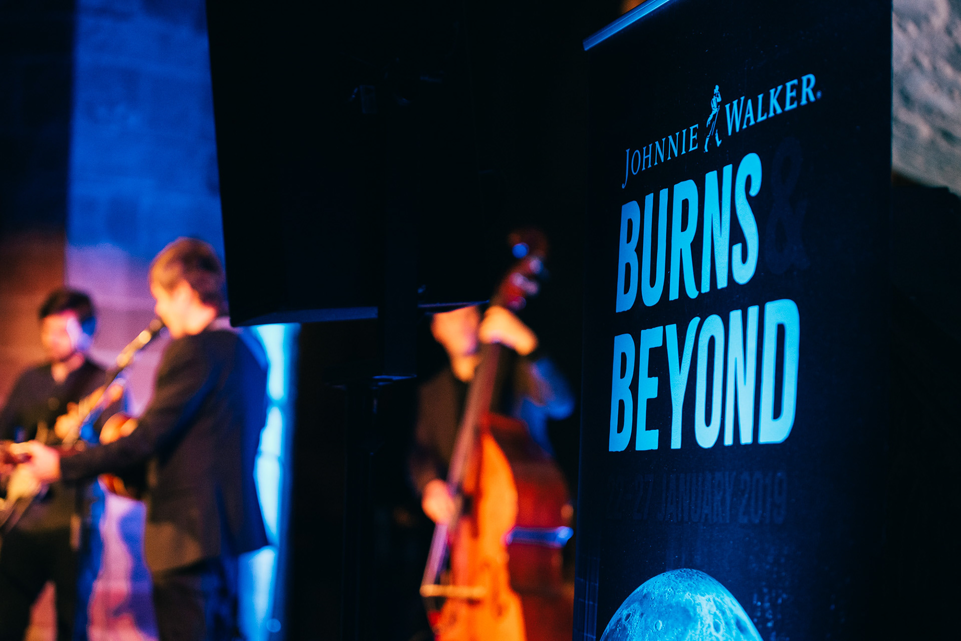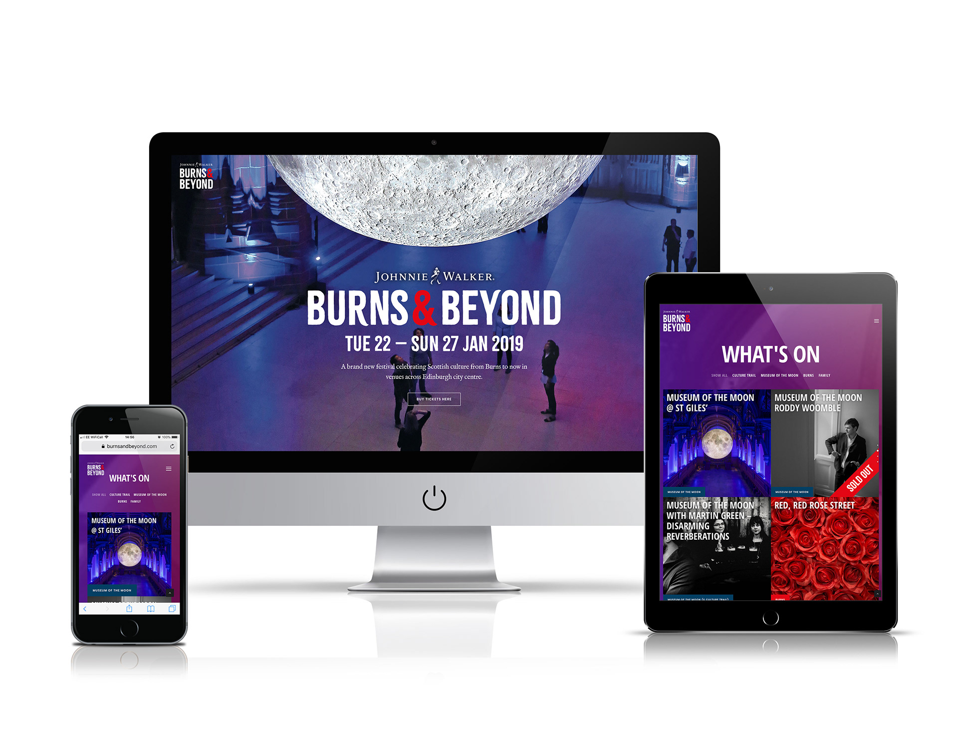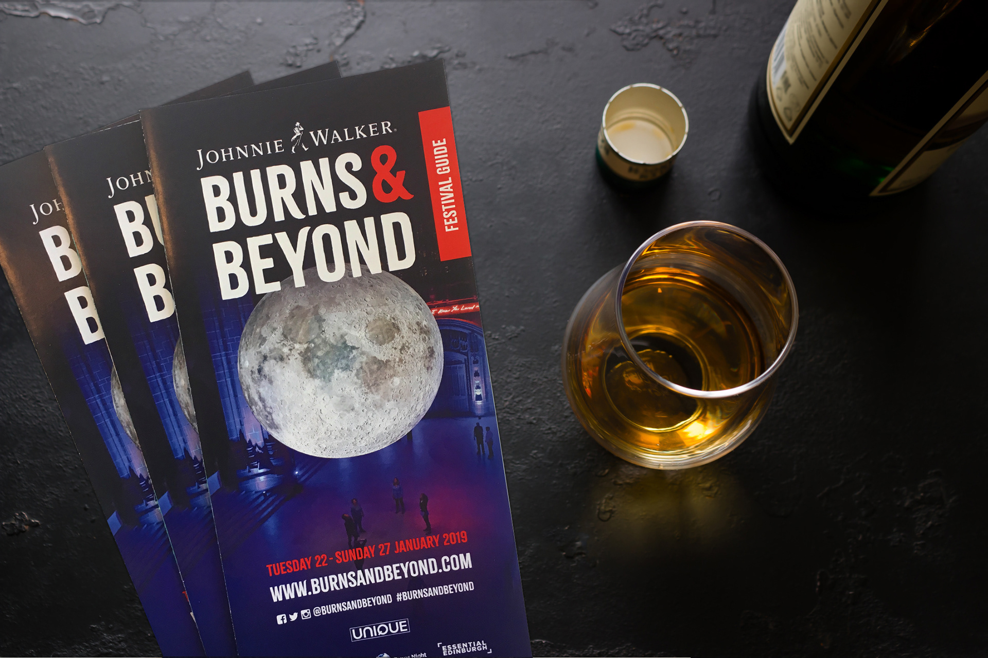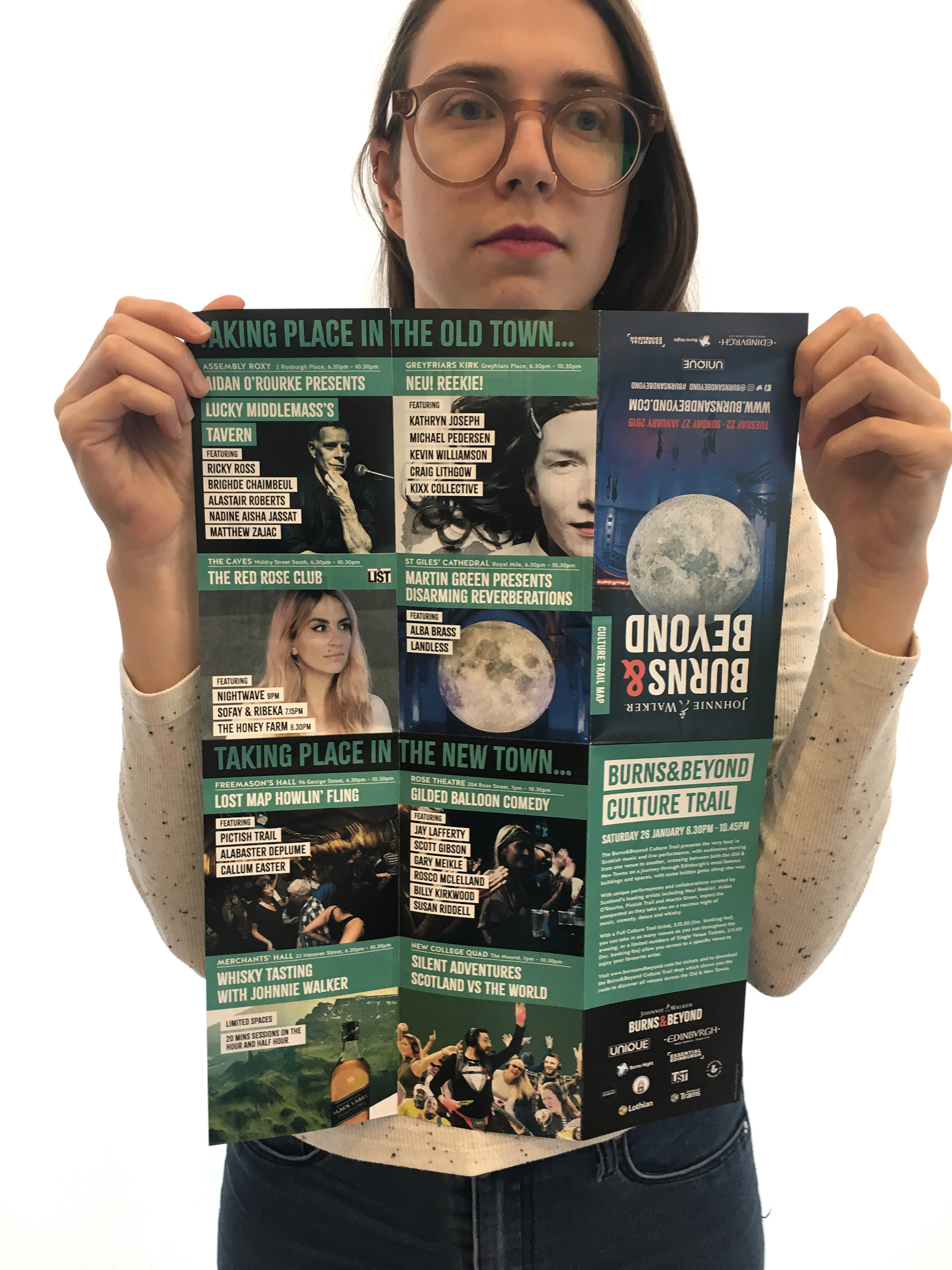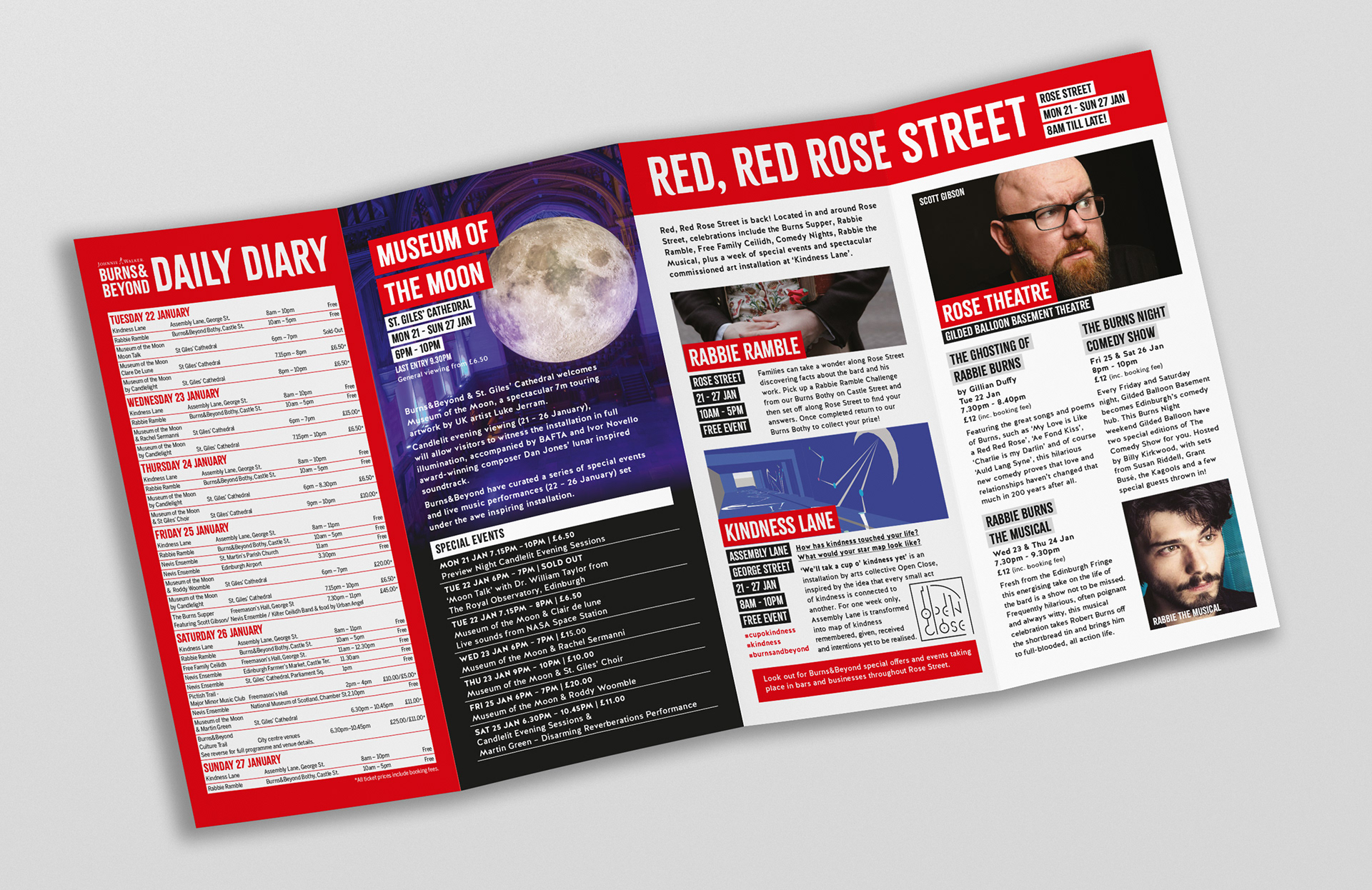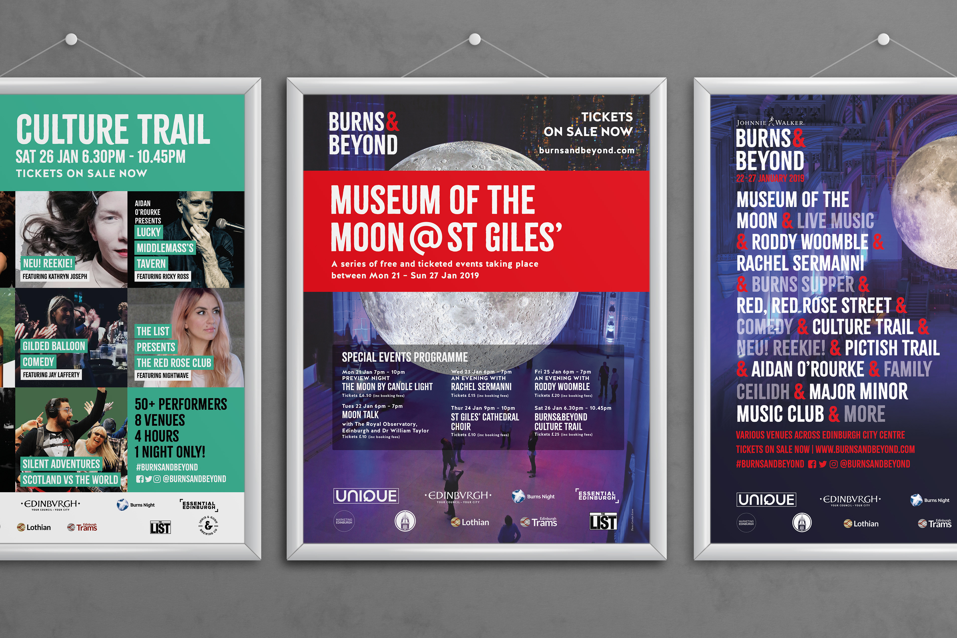
With a wonderfully mixed programme (whisky speed tasting for one) we needed a design format that could hold lots of information without looking cluttered and confusing. The ampersand in the logo also gave us an opportunity to tie Burns to the many different festival events. The design was applied to multitude of formats and purposes, including website, social media, posters, adverts, leaflets, outdoor signage and on-site branding.